Roots — Designing safe spaces for electoral and civic participation
Roots is a mobile app designed with young voters in mind. During my 5 month UX Design academic experience with Springboard, I researched, designed and tested this mobile app as my capstone project. After having worked in political and advocacy tech for many years, I wanted to explore some of the challenges that I have experienced in this field.
MY ROLE: User Researcher, UX Designer, Project Manager
DURATION: 5 months; Oct 2022 - Mar 2023
KEY SKILLS: Generative, Descriptive & Evaluative Research, Site Mapping, Affinity Mapping, User Flows, Sketching, Wireframing, Visual Design, Prototyping, User Testing, Analysis
IMPACT MEASUREMENT METHODS: Unfortunately I could only measure impact based on the final interviews and testing with users as this wasn’t a developed product.
MEDIUMS : Digital: High-Fidelity Prototype
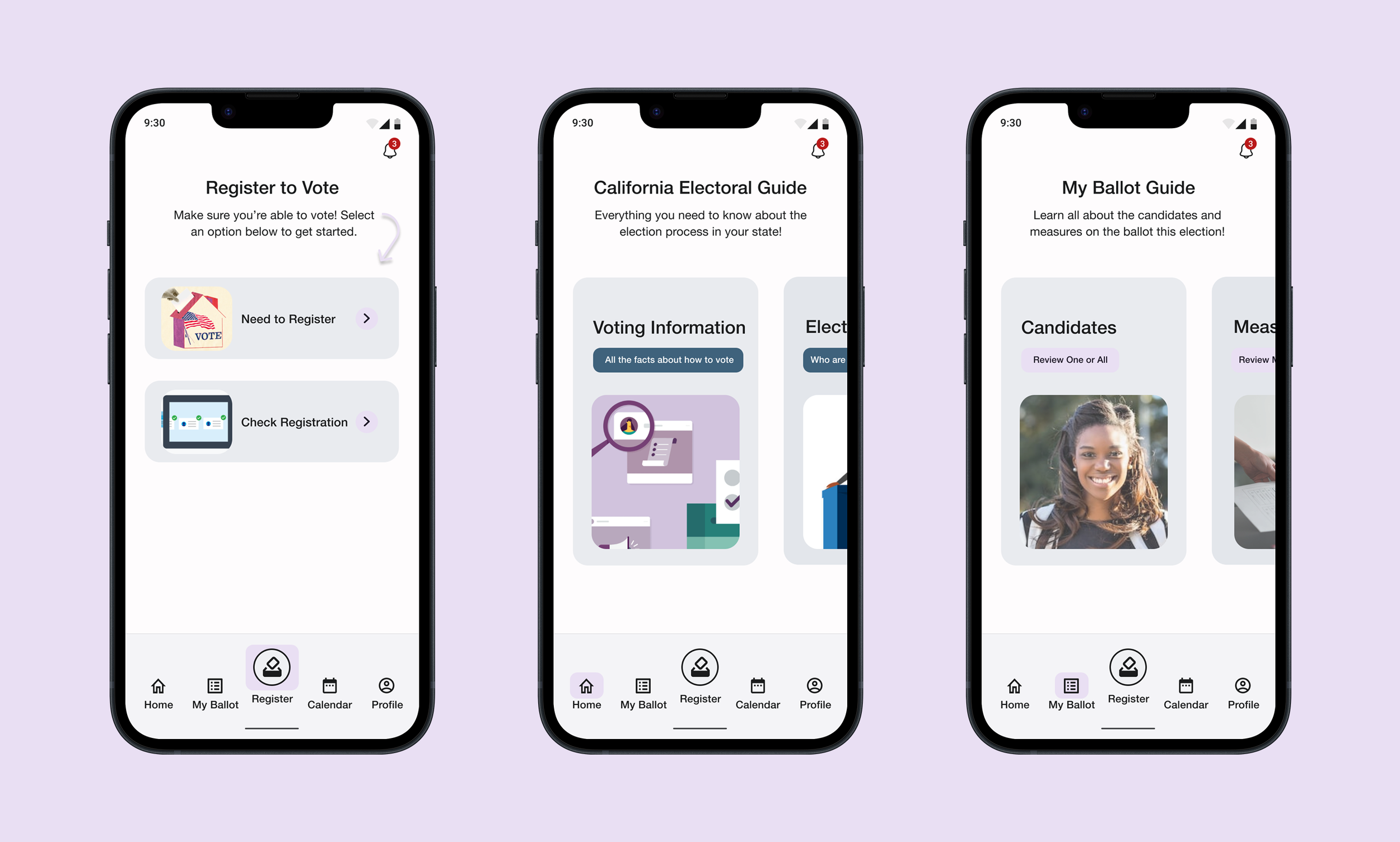
Primary actions for Roots users — Register, Learn State Voting Rules, Review Ballot Candidates and Issues
Background
Young people (18-35) tend to be less likely to engage in both local and national elections, but drastically less so in local elections. With the potential to be the largest voting group in the country, there is a lot to gain from this group being civically active and a lot to lose if they continue not to be. I wanted to better understand what problems exist for these users and how they impact their participation in both local and national elections.
Objective
Understand the behavioral and environmental barriers to participation and find possible solutions to increase engagement.
Research Questions
What are the biggest challenges to engaging with both local and national elections?
Do young people want to be politically active and engaged?
Why are young people more likely to vote nationally vs locally?
How do young people feel when they’ve participated in an election and why did or didn’t they take the action again?
Have there been successful experiences when engaging in an election and what did that look like?
Approach
Deliverables
A high-fidelity prototype, with necessary iterations based on user testing.
Research & Analyze
Secondary Research
It was important to gather information to understand the problem space and note any patterns that existed. I read through literature reviews, reviewed government data and organized a competitor analysis to see how others may be trying to solve this problem. I discovered common barriers as a consistent pattern in reduced voter participation; lack of civic education, confusing electoral systems and access & inequality.
Primary Research
I conducted and moderated 6 remote video interviews, to better understand users' political interests, civic participation and their behaviors, motivations and habits. I also distributed a survey with more quantitative questions and had 50 responses.
Participants
Ages 18-35
Lives in the United States and is eligible to vote
Has and hasn’t voted in a local election
Has and hasn’t voted in a national election
Core Themes & Key Insights
Content: Content can be really confusing. Research and review of voting processes, candidates and issues can require a lot of time and result in information overload.
Delivery & Communication: There needs to be connection between voters and representatives, help with planning and a stronger digital presence.
Social & Relational: There is strong social trust and influence with peers and their community.
Young people are highly motivated to participate in the electoral process, but too many barriers prevent them from following through with this action regularly.
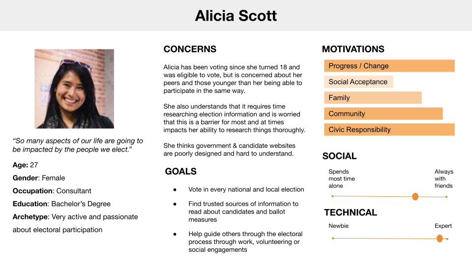
Persona 1: Active Voter
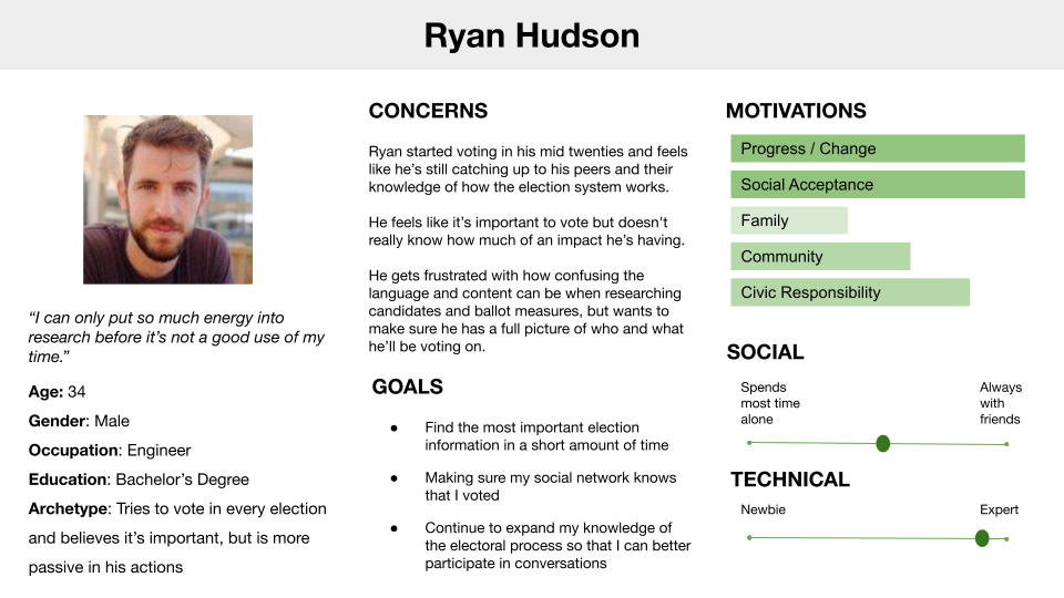
Persona 2: Passive Voter
A simple system makes a difference
When interviewees and survey respondents reported on effort required to participate in the electoral process, it always came down to state election rules. States that allow for mail-in-ballots, same day & online registration and convenient polling locations make it easier for voters to get involved.
Voting is Social
Young voters trust their peers to provide them sources of election information. Their behavior is also influenced by social expectations.
“It matters that my friends know that I vote, there is an expectation and pride with voting in my social circles.”
Content Matters
The way electoral content is written and dispersed, can confuse and overwhelm voters leaving them to either not take action at all or make an uninformed decision.
“The biggest challenge for me has been to fully understand ballot questions and feeling unsure of where to look for additional information about the questions & candidates.”
Make Contact
Young voters care about local candidates and want to get to know them but don’t hear about or from them.
“You remember the presidential elections, candidates for these tend to be different and the process tends to be less work.”
Explore: Concept Development
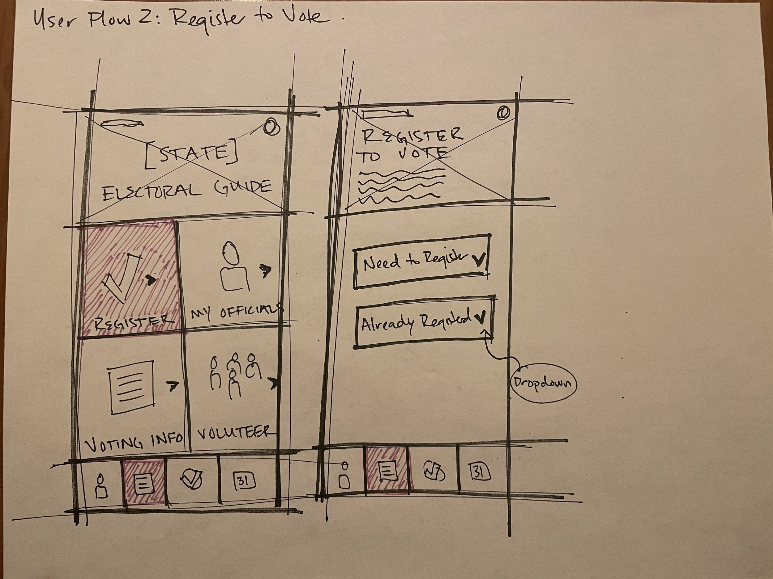
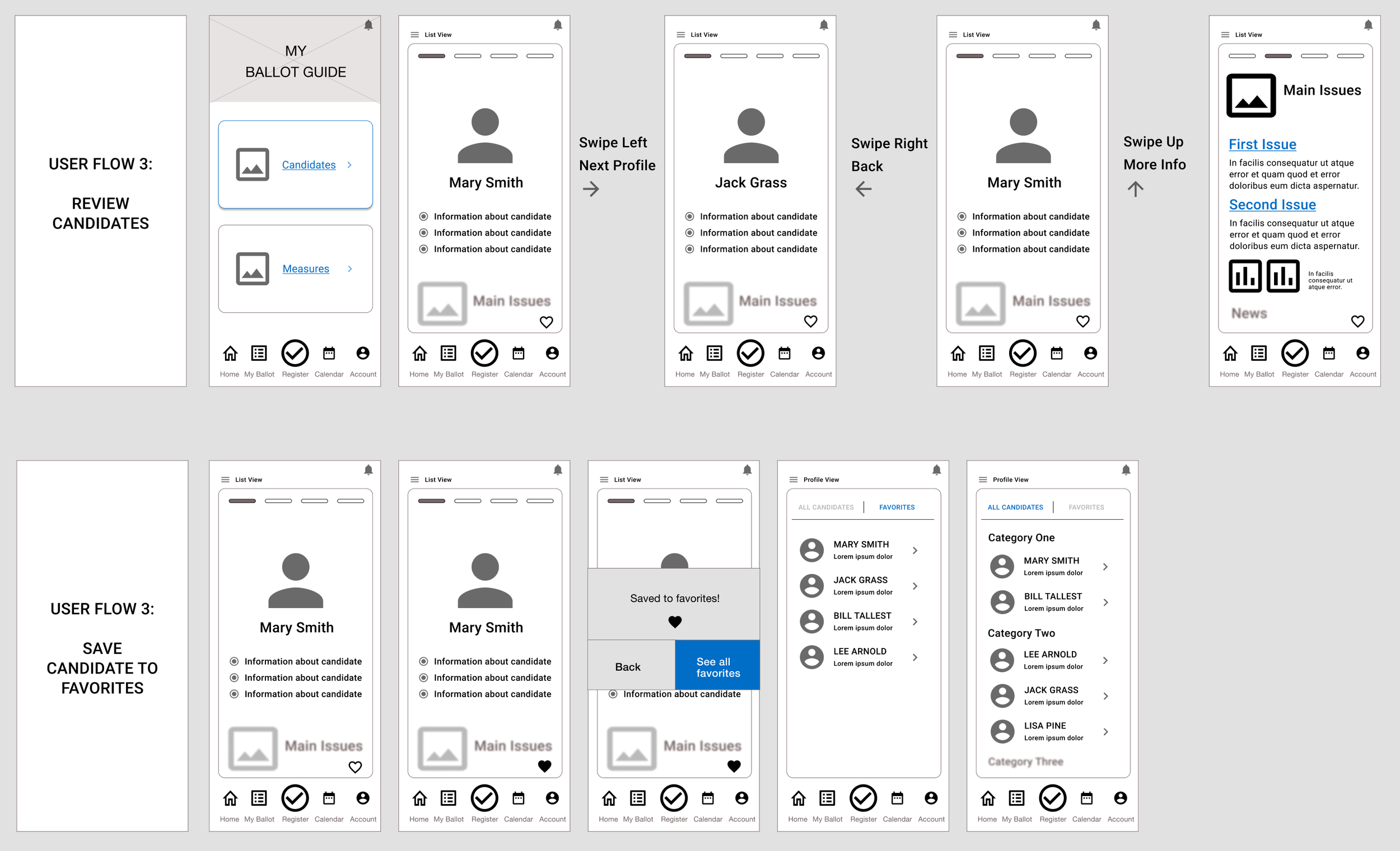
Sketches, Guerilla Usability Testing & Wireframes
The usability tests took place in person, with five participants, in a home environment. The goals were to test how effectively participants could complete four priority tasks that were each related to a red route user flow. As the main flows within the tool, it was important to discover any barriers or large usability issues users may have that prevent them from accomplishing their own goals. The test was created by linking sketches together within a prototyping app, so that users could more easily move through tasks on a device that was familiar to them. Findings from testing:
Primary purpose and benefits of the app are clear.
Path to register to vote needs to be clearer.
Icons are confusing.
Favorite lists are important and need to be easier to find.
Random sorting of candidates is important for a nonpartisan experience.

Prototype & Design Solution
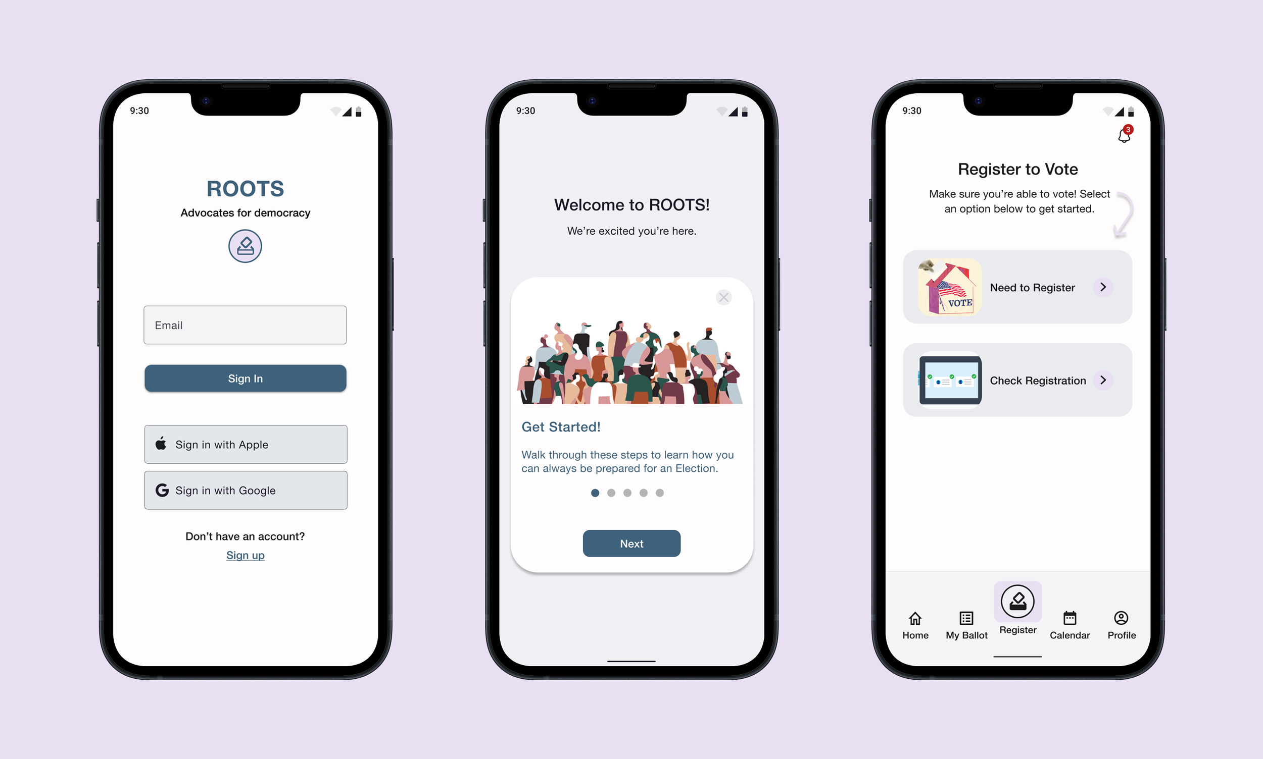
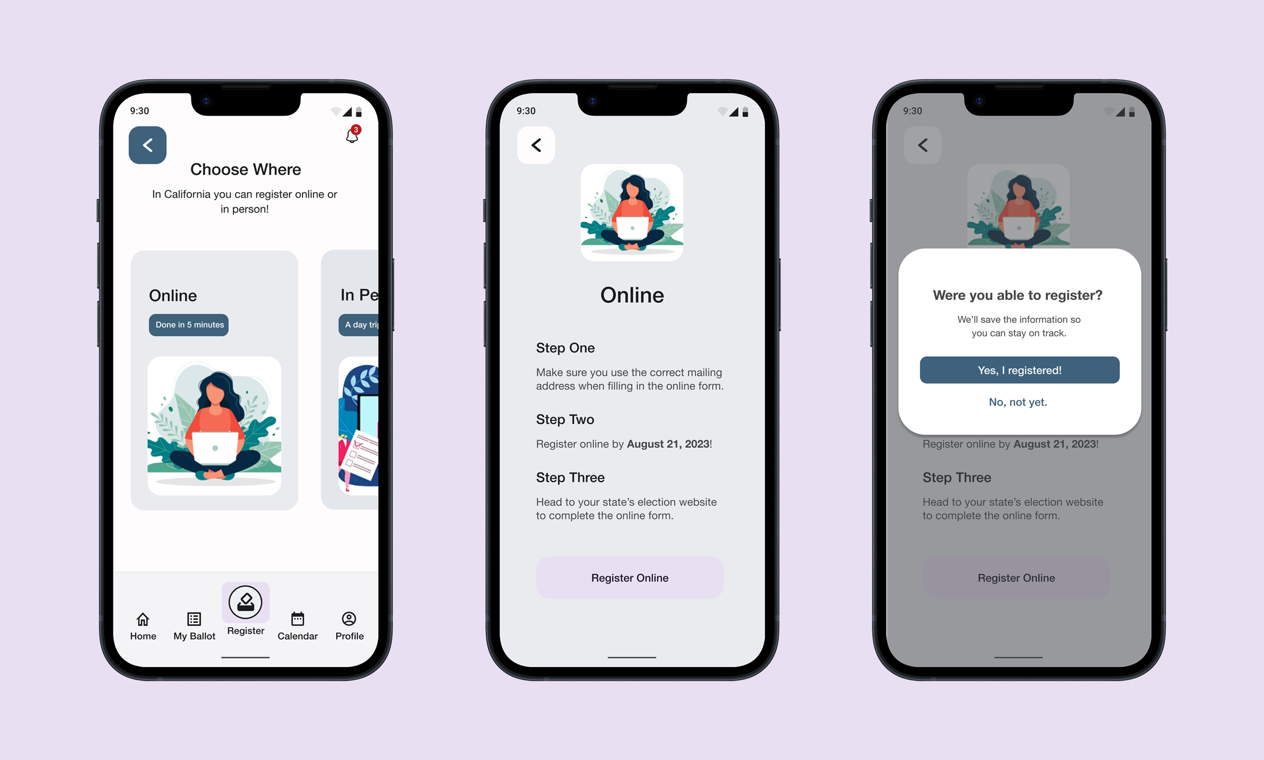
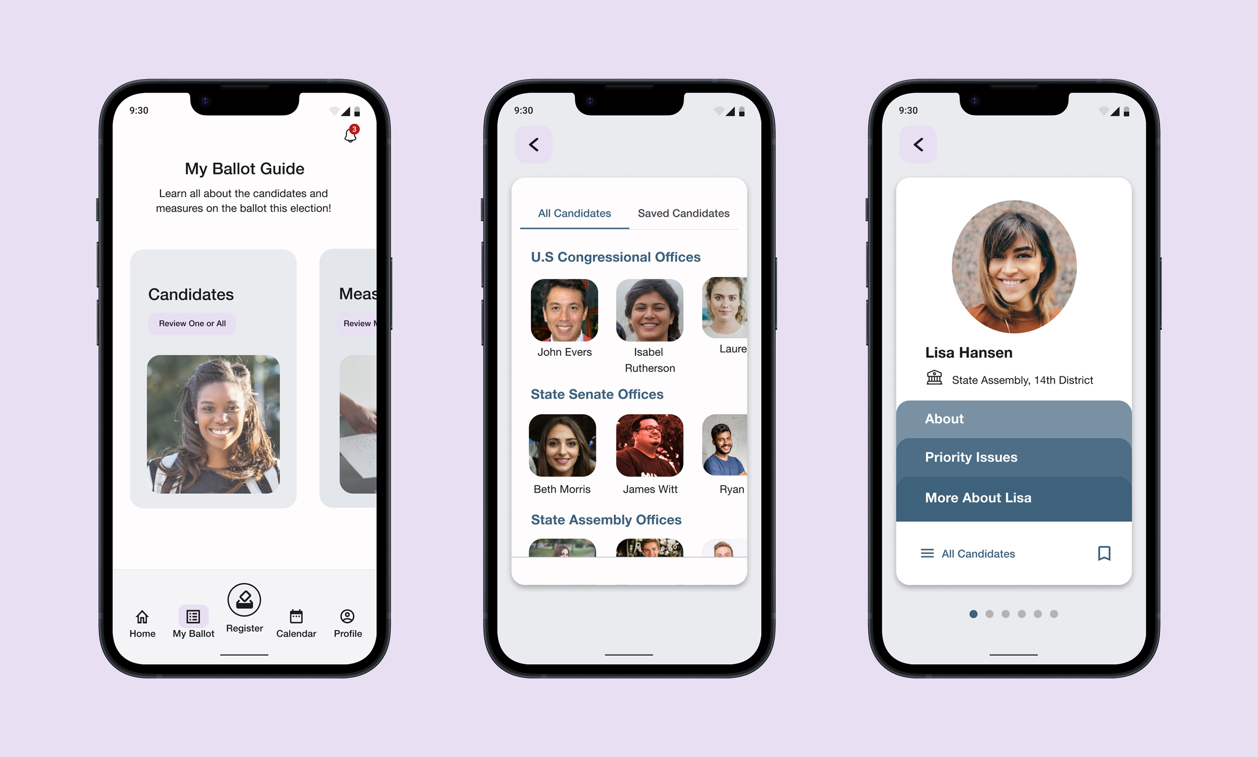
Based on what I learned from the exploration phase, I knew I wanted to create something that was simple, engaging and clear for users. As I learned from interviews and initial testing, voters are mostly looking for the simplest path to get them to where they need to be to participate.
Roots went through its first round of usability tests using a high-fidelity prototype. The broad goal of this initial test was to see if the designs were working as intended and to discover any critical issues users may have when using the app. The moderated testing sessions were conducted remotely and lasting between 30 minutes to an hour. I tested five participants, by myself, and they were recruited through a mix of Springboard slack community and personal community network.
Main Findings
Comprehension: As expected with a political app and as discovered through previous user interviews, there is a lot of confusing language in electoral content and it’s especially confusing for a first time user. Throughout the usability sessions, users found themselves confused by certain language which created barriers for them to complete tasks as well as confusion about where to look for help.
Candidate & Issue Lists: As the candidates and issues (formally measures) are arguably some of the most important sections of the app, they need to be clear, easy to navigate and easy to find again. Almost all users struggled to find and complete tasks that involved getting to these lists. In addition, messaging for young voters should focus on issues, not party.
Nonpartisan Reactions: Most users had really positive feedback about the app’s neutral design. They often reflected that it might be important for their own review process and were happy to see it designed in a way that challenged that thinking.
Iterate
I wanted to solve the critical issues noted during my first round of usability testing and make some small (hypothetically low dev) design changes. Roots then went through its second round of usability testing with five new participants.
Design Changes
Updated/edited confusing language, provided more information on the login screen about the app, inserted more guidance where possible.
Changed the initial screen users land on for candidates & issues with the list view vs the profile view (users found it more intuitive to see a full list first), and updated the lists language and icons.
Added a submission button to account creation screen, removed back buttons that weren’t necessary, made exits clearer.
Thoughts For The Future
Lists were very important for users and where they had the most curiosity. Lists allow users to organize their thinking about how they want to vote, they wanted a more prominent and developed list feature. Almost every user wanted the ability to compare candidates on these lists and a more nuanced rating system. An important finding — sorting the app by issue areas versus candidates might be a more neutral way to approach candidate research and help develop a connection between important issues and candidates.

![Capstone_ Work in Progress Presentation [Nicole Woods] (1).jpg](https://images.squarespace-cdn.com/content/v1/6424f830a48c8e7626f5eef4/8666def6-66c8-4af1-aeb3-0782d42403dd/Capstone_+Work+in+Progress+Presentation+%5BNicole+Woods%5D+%281%29.jpg)
![Capstone_ Work in Progress Presentation [Nicole Woods] (2).jpg](https://images.squarespace-cdn.com/content/v1/6424f830a48c8e7626f5eef4/85f1f6e3-2c14-4410-8ff8-b104d5d5f718/Capstone_+Work+in+Progress+Presentation+%5BNicole+Woods%5D+%282%29.jpg)
![Capstone_ Work in Progress Presentation [Nicole Woods] (3).jpg](https://images.squarespace-cdn.com/content/v1/6424f830a48c8e7626f5eef4/4be348e0-fbeb-4594-aa4d-433fc60b78fb/Capstone_+Work+in+Progress+Presentation+%5BNicole+Woods%5D+%283%29.jpg)
![Capstone_ Work in Progress Presentation [Nicole Woods] (4).jpg](https://images.squarespace-cdn.com/content/v1/6424f830a48c8e7626f5eef4/eb7e5764-0411-4df9-98f0-e57b0de46dd9/Capstone_+Work+in+Progress+Presentation+%5BNicole+Woods%5D+%284%29.jpg)